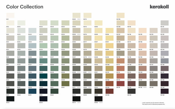
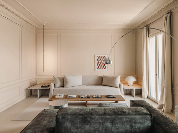
The Color Collection color palette consists of 150 sophisticated shades located on 15 vertical chromatic scales: from delicate whites to pastels to darker, highly saturated colors that are ideal for harmonious combinations.
The palette consisting of elegant color ranges allows all colors to complement or combine with each other, so you get the following
offers the opportunity to make bold, matching decisions in design and decoration. Every color is composed of very high-quality pigments combined with oils and natural active ingredients to achieve particularly richer and more intense shades, characterized by unparalleled color depth and decorative effect.
Neutral Grey
A color family that ranges from absolute white, the lightest color in the entire palette, to black. Neutral Gray consists of 12 extremely versatile shades and has different light and medium grays that reach slate and anthracite with increasing intensity. Ideal for brightening up neutral-toned interior designs or sophisticated black-and-white environments.
KK 01
#fdfff9
KK 02
#f8fcf7
KK 03
#e9eeea
KK 04
#dbe0dc
KK 05
#cdd0cd
KK 06
#b8bcb8
KK 07
#9ca19f
KK 08
#878b89
KK 09
#727574
KK 10
#5c5f5d
KK 11
#3f433f
KK 12
#323836
Cold Grey
It's a color gamut consisting of predominantly cool grays, from bluish white to ash gray, through blue undertones in between, and denim or titanium gray with a technical effect. These colors go well with cool colors like blue or with blue-veined materials like Carrara marble.
KK 13
#f4ffff
KK 14
#e4eff0
KK 15
#d6e0e0
KK 16
#cad2d3
KK 17
#bfc8c9
KK 18
#a8b1b1
KK 19
#949c9e
KK 20
#828a8c
KK 21
#6b7475
KK 22
#575f60
Navy Blue
A group of classic blues, reinterpreted in a contemporary way - the blue group includes baby blues, dusty sky blues, bold ceruleans, all the way to intense ultramarines and navy blues. These tones are a safe choice for contrasting wall painting in living spaces or for painting the entire sleeping area.
KK 23
#e6f5fd
KK 24
#d5e5f0
KK 25
#cadae3
KK 26
#a0b0bb
KK 27
#87969f
KK 28
#788993
KK 29
#557484
KK 30
#3a5b6b
KK 31
#225065
Petrol Blue
The palette is dedicated to light blue and petrol blue. The uniqueness of this family is represented by its dualism - the first colors are actually sophisticated platinum grays and not neutral neutrals. It then continues with tones of Cyan, Turquoise, the iconic Tiffany Blue and Green Tea Leaf Blue before finishing with the saturated color Tea Blue and Petroleum.
KK 32
#ecf1e9
KK 33
#d9dfd8
KK 34
#d1d7d0
KK 35
#cadace
KK 36
#a4b9b2
KK 37
#83a29e
KK 38
#587d81
KK 39
#255d61
KK 40
#2b4b52
KK 41
#363d49
KK 42
#2f373e
Natural Green
The first family of greens - Natural Green are shades of green inspired by mint, sage and forest tones. A modern palette, brought up to date with cool shades borrowed from the blues and dusty grays that dominate the entire collection. These are relaxing and extremely versatile colors that can be used as neutrals to transition to more vibrant tones.
KK 43
#e4efe6
KK 44
#dbe7dd
KK 45
#d2ded3
KK 46
#c4cfc5
KK 47
#aab4aa
KK 48
#9ca79d
KK 49
#8d9f8f
KK 50
#77887c
KK 51
#69796d
KK 52
#4d5d51
Olive Green
The second green family of the palette, consisting of soothing colors with a strong personality. Olive Green are greens with suggestive yellow hues that take their inspiration from the flora: they range from light and gentle colors to military hues of varying intensities, ending with vibrant colors interspersed with acid hues. On the spectrum of the Color Collection, greens balance between cold and warm colors.
KK 53
#ebedda
KK 54
#dbdecb
KK 55
#ced1bb
KK 56
#c6c6ae
KK 57
#b0b095
KK 58
#a1a48d
KK 59
#91937c
KK 60
#8f8353
KK 61
#7c7249
Warm Grey
A selection of warm and welcoming grays - 12 shades from white to ash grey, pearl grey, smoke grey, charcoal grey, lead gray and gloss black. Warm Gray is considered the cornerstone of contemporary style, combining minimalism and warmth and is ideal for both domestic and commercial environments.
KK 62
#f1f4e8
KK 63
#e6e5d7
KK 64
#d7d5c7
KK 65
#cac8bd
KK 66
#c0beb3
KK 67
#b0b1a8
KK 68
#9c9d95
KK 69
#82817a
KK 70
#73726c
KK 71
#605f59
KK 72
#474943
KK 73
#333836
Greige
The mid-tone family of the Color Collection, composed of greige and dove gray shades – these nuances are now considered basic colors and are widely used in interior design projects. The 11-color palette pays tribute to these shades: it starts from warm white, then moves through sand, beige, and biscuit tones towards elegant browns and chestnut colors.
KK 74
#fafdf2
KK 75
#fafbec
KK 76
#e9e7d7
KK 77
#e2dfcb
KK 78
#d3cfbd
KK 79
#cac2af
KK 80
#b7af9c
KK 81
#9e9687
KK 82
#8a8375
KK 83
#716d61
KK 84
#68655c
Modern Yellow
The first yellow group of the collection - Modern Yellow are incredibly elegant shades that include creamy white and naturally warm colors such as corn yellow. The dusty ingredients are devoid of shades to actualize and transform the most intense yellow shades into sophisticated dove grays, yellows and dark browns. The group is ideal for updating classic environments furnished with antique and timeless pieces.
KK 85
#fcfae2
KK 86
#fef8dc
KK 87
#fef4d4
KK 88
#f4e6c4
KK 89
#e4d7b6
KK 90
#d6c9ac
KK 91
#c0b298
KK 92
#978c78
KK 93
#6e6656
KK 94
#4c483e
KK 95
#1d1d1b
Dusty Yellow
The second group of yellows in the palette, the Dusty Yellow powder shades, illuminate the Color Collection with warmth thanks to their amber shade, from the traditional ocher yellow to the modern shades of saffron and mustard to fresh copper, rust and sophisticated brick red shades.
KK 96
#fcf0c9
KK 97
#f7e7b9
KK 98
#f8e2ac
KK 99
#eedaa6
KK 100
#e0c892
KK 101
#d8ba7a
KK 102
#c8a161
KK 103
#95583c
KK 104
#7a443c
Desert Peach
A distinctive color scheme that started with sophisticated neutrals of pink, pastel and khaki, continued with sixties-inspired colors such as peach, apricot, and ended with vibrant coral and magenta. These tones are ideal for original projects with personality.
KK 105
#ebe9dc
KK 106
#e9e5d5
KK 107
#e0d8c5
KK 108
#d8cebd
KK 109
#cec5b4
KK 110
#bcb5a6
KK 111
#caa78c
KK 112
#c39278
KK 113
#bf806a
KK 114
#924b43
Neutral Pink
A family that includes pink and dove gray neutrals with red undertones, up to expensive purple red and a neutral color for combinations with a strong aesthetic impact. The Neutral Pink family enables sophisticated and decisive decoration of the environment.
KK 115
#f9faf1
KK 116
#f5f0e1
KK 117
#ece3d6
KK 118
#d9d3c9
KK 119
#d1cabe
KK 120
#bfb6af
KK 121
#a09892
KK 122
#87756e
KK 123
#6a4a49
KK 124
#504e4d
Rose Pink
The second pink group of the Color Collection - Rose Pink are delicate, fashionable nude shades, from pale and pastel colors to more intense and antique colors to maroon-toned sepia.
KK 125
#fcf6ed
KK 126
#f4e9dc
KK 127
#eddfd1
KK 128
#e5d3c5
KK 129
#dbc6b8
KK 130
#be9a8e
KK 131
#a58478
KK 132
#80776c
Soft Lavender
A cool color palette that gradually includes purples in delicate and pastel versions, inspired by the world of flowers. Soft Lavender's discreet and sophisticated colors range from light purple to wisteria and lavender.
KK 133
#e9e9e6
KK 134
#dbdcd9
KK 135
#d9d7d4
KK 136
#cdc9c9
KK 137
#b6b4b6
KK 138
#a19fa0
KK 139
#989392
KK 140
#89817b
Purple
A color palette that combines contemporary pop spirit with subtle and dusty tones. Violet is a range of contemporary violets, from delicate and dusty light tones to intense intermediate shades - lively and vibrant, but never violent, from periwinkle to purple to aubergine.