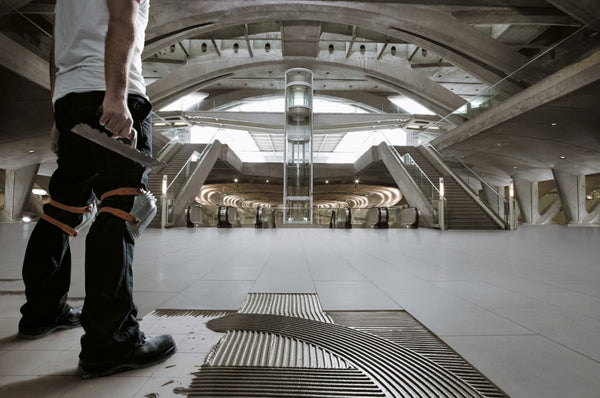
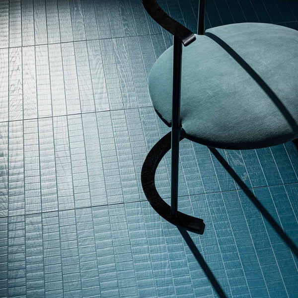
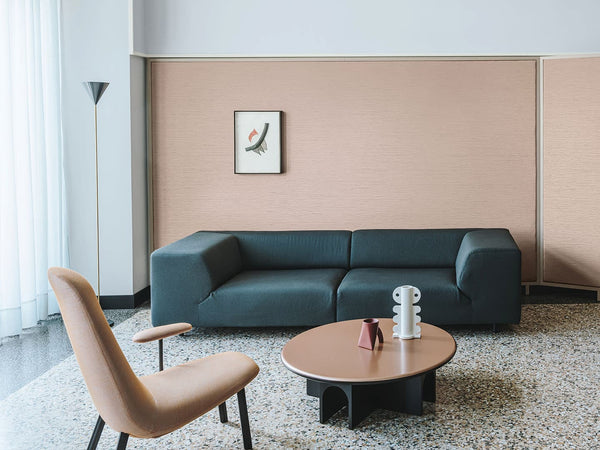
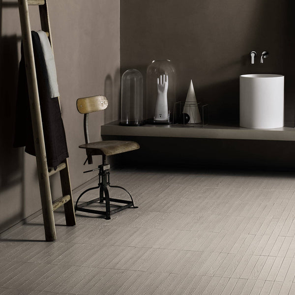
An integrated system with various surface treatments: paints and glazes, resin coatings and floor coverings, handcrafted hardwood floors. All coordinated in 150 contemporary colors.
In the world of interior design, Kerakoll has achieved something extraordinary with the Color Collection. 150 is a balanced number capable of satisfying the most diverse project requirements, as it offers a wide selection within a closed, directed, and coordinated palette.
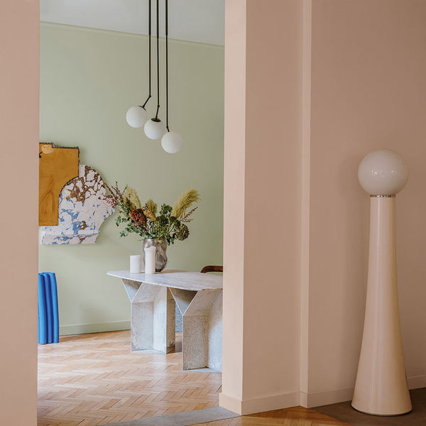
This is not just a random assortment of colors. As Kerakoll puts it, these 150 contemporary colors represent an elegant chromatic journey through neutral and colorful shades, designed to guide the designer or client to the final choice.
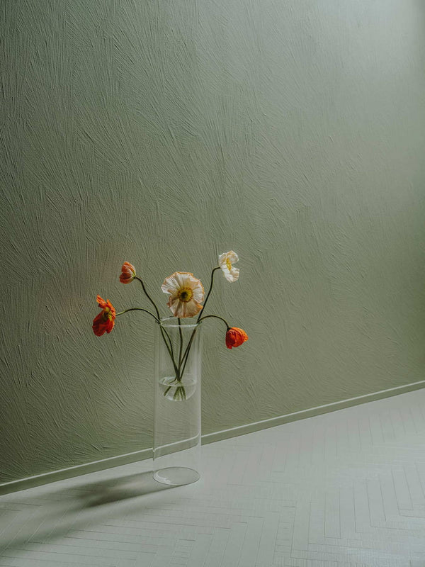
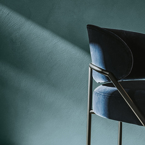
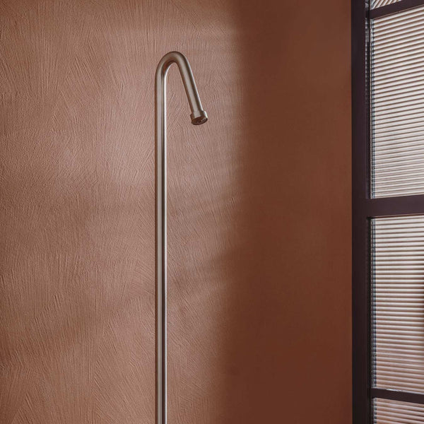
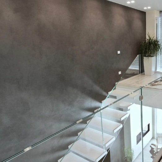
What truly makes the Color Collection special is the refined color palette designed to meet the needs of contemporary design and people's living comfort. The secret? These are dusty tones characterized by a subtle gray undertone.
This delicate but crucial detail means that every color in the collection naturally harmonizes with all the others. There are no sharp contrasts, no distracting combinations – just sophisticated, contemporary colors that work effortlessly together.
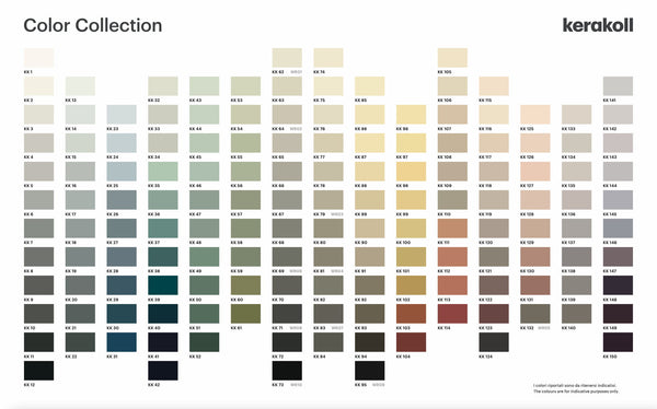
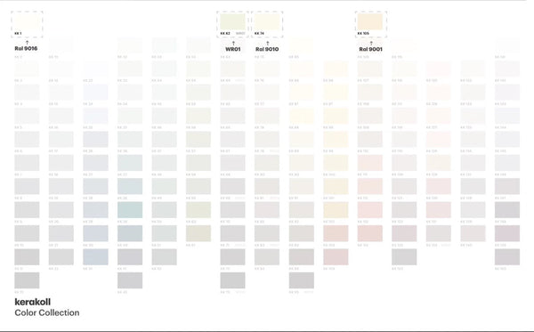
The color chart presents fifteen elegant palettes vertically, each with a color scale of increasing intensity. The progression in each palette is as follows:
The 15 color families:
According to the Color Collection system: "When colors are selected vertically, it is possible to create rooms that show perfect chromatic continuity and tone-on-tone combinations."
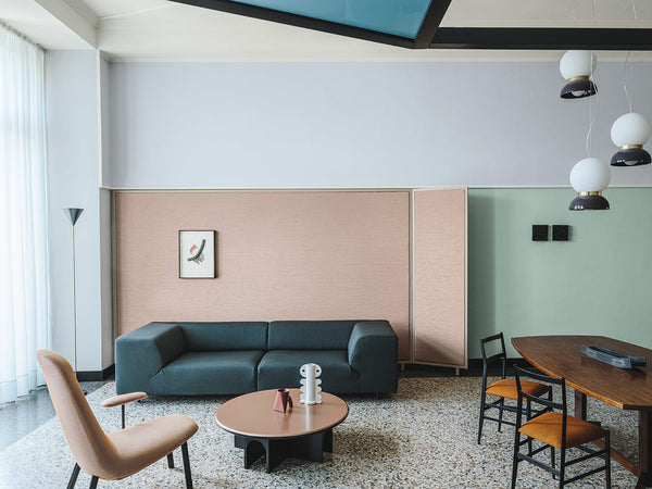
This means that when you choose colors from a single vertical palette – whether all from Neutral Gray or all from Natural Green – a harmonious result is guaranteed. The progression from light to dark within each family ensures that your choices will always work together, creating sophisticated monochromatic schemes without the risk of error.
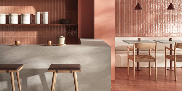
This is where the system truly becomes revolutionary. According to the presentation explanation: "Selecting colors horizontally results in polychromatic combinations with equal saturation levels, which can be safely combined thanks to the elegant, dusty tones running throughout the entire color chart."
The key insight? No shade dominates the others; the combinations are balanced.
When you select colors horizontally – choosing from different families but at the same intensity level – you create vibrant, multicolored schemes that maintain perfect balance. A medium tone from Navy Blue, Natural Green, and Desert Peach will work beautifully together because they share the same saturation level and those key dusty undertones.
Recognizing that grey has become the cornerstone of contemporary design, the Color Collection includes 4 grey families to meet the most demanding requirements:
Perfect for those who desire a true gray. Made only with black and white pigments.
This family starts with absolute white (KK 1) and progresses to black through light and intermediate gray shades, which with increasing intensity move towards slate gray and elegant anthracite gray.

Ideal for combinations with natural stones such as Carrara marble, or for contrasts with light blue and blue shades.
These are cool gray tones offering elegant ash grays, blue-tinged intermediate grays, ultra-contemporary denim blues, and titanium grays with a technical appeal.
These are friendly grays that our private clients prefer the most, as they are enriched with yellow and red undertones, making them warm and cozy. A safe choice.
Perfect for lovers of dove gray, these shades have been a trend in interior design for years.
This family starts with warm white (KK 74 = RAL 9010) and runs through sand, beige, and dove gray to refined biscuit shades and elegant brown and chestnut tones.
The Color Collection includes the 4 most widely used white shades in the design world:
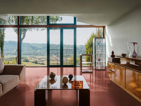
What truly distinguishes the Color Collection is that it is the only European project that successfully offers paints, glazes, decorative resins, Cementoresina, and Legno+Color floors and the invisible baseboard, all available in 150 color chart colors.
The color chart can be read both vertically and horizontally, according to the needs of the project. This dual approach means:
As the presentation emphasizes, these safe polychromatic combinations are possible "even when the designer's intention is to shock and surprise with the use of numerous variations of color."
At Masterworks, we bring you the complete Kerakoll Color Collection – a system that turns the complexity of color selection into a simple, error-free process. Whether you are a professional designer or a homeowner undertaking your first project, these 150 colors provide everything you need for stunning results.
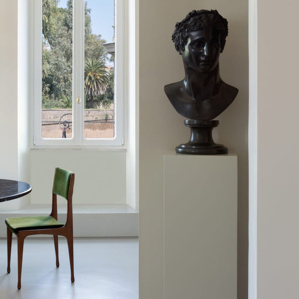
The Color Collection is more than just paint colors – it is an integrated system of colors and surfaces for interior decoration, ensuring perfect coordination in every element of the space.
Visit our Budapest showroom to experience the Color Collection in person, or browse the Kerakoll Design products on our website. Discover how 150 carefully selected colors can transform your interior design approach.
Masterworks Hungary Ltd – Your specialist for Kerakoll green building materials and the full Color Collection range. Creating beautiful, sustainable spaces has never been so accessible.
Kerakoll Design is an integrated project that includes innovative materials - resin, cement, handcrafted wood, micro-coatings, paints, and glazes - harmonized on a single color palette.